Plotting series on different axes

Im using this code to plot my data but because their ranges are quite different, i need different axes to view the smaller time series. Here is my code:

import pandas as pd
from pandas import Series
%matplotlib inline
from statsmodels.tsa.seasonal import seasonal_decompose
from sklearn.preprocessing import RobustScaler

# Seasonal exploration visualizing ts
import matplotlib.pyplot as plt
import seaborn as sns

# Set 3 of commands to plot 1 column from multiple series on excel file
df=pd.read_excel('DataLSTMReady.xlsx')
df=df.set_index('Date')
df=df.iloc[:,[0,1,3]] #df=df.iloc[:,0:4]
list_of_column_names = list(df.columns)
print(list_of_column_names)
print(df)

df[list_of_column_names].plot()#df['Infl Mens'].plot()

sns.set(rc={'figure.figsize':(11, 4)})
df[list_of_column_names].std()

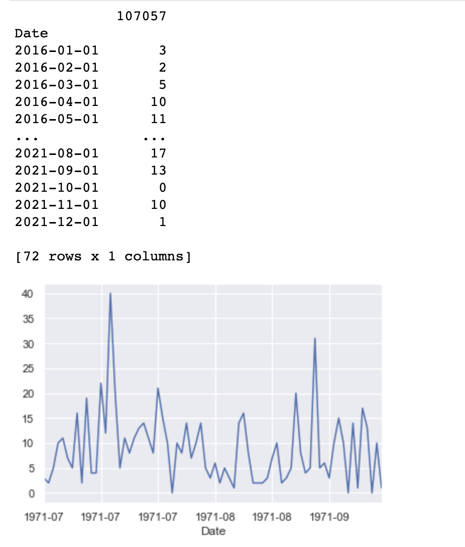
and I get all the data as expected and this chart at the end:

Here is my data:…uh, how do i attach an excel file?

I managed to do this I found in stackoverflow:

import pandas as pd
from pandas import Series
%matplotlib inline
from statsmodels.tsa.seasonal import seasonal_decompose
from sklearn.preprocessing import RobustScaler

# Seasonal exploration visualizing ts
import matplotlib.pyplot as plt
import seaborn as sns

#nifty = Series.from_csv('ManualStepTimeSeries.csv',header=0)
# Set 1 of commands to explore dataseries
#nifty.head()
#nifty.size
#nifty.describe()

# Set 2 of commands to plot series
# from matplotlib import pyplot
# pyplot.plot(nifty)
# pyplot.show()

# Set 3 of commands to plot 1 column from multiple series on excel file
df=pd.read_excel('DataLSTMReady.xlsx')
df=df.set_index('Date')
df=df.iloc[:,[0,1,3]] #df=df.iloc[:,0:4]
list_of_column_names = list(df.columns)
print(list_of_column_names)
print(df)

# #MATPLOTLIB PLOTS
# #FIRST EXAMPLE FULL SERIES PLOT - TURN OFF WHEN SEASONAL PLOT EXPLORATION
# #imported matplotlib as plt
ax1 = df['107057'].plot(style='b-') #plots 1 series
ax2 = ax1.twinx()
ax2.spines['right'].set_position(('axes', 1.0))
df['Infl Mens'].plot(ax=ax2,style='r-') #plots 2 series
ax3 = ax1.twinx()
ax3.spines['right'].set_position(('axes', 1.1))
df['107057-mkp'].plot(ax=ax3,style='g-') #plots 3 series

sns.set(rc={'figure.figsize':(11, 4)})

df[list_of_column_names].std()

And I get this plot which works, but Im not sure why i get those gridlines in the background.

I would also like to get rid of the timestamps on the x axis and replace it with just the months. How can i format the xaxis in this combined plot to show only mm-YY? I tried this code but it doesnt change anything when I plot it. I did it for ax1, ax2 and ax3:

ax1.xaxis.set_major_formatter(mdates.DateFormatter("%Y-%m"))

dear quique123.

Thank you for your contribution to the anaconda community.

Basically, it’s a matter of technique. For example, to express as follows, use the following script.

fig = plt.figure(tight_layout=True, dpi=120)
plt.xlabel(“date”)
plt.ylabel(“Temp ℃”)
plt.title(‘temperature in Tokyo’)
plt.xticks(np.arange(0, cnt, step=90*24), rotation=45)

plt.plot(df1.date, df1.temp, label=“2020FY”)
plt.plot(df2.date, df2.temp, label=“2021FY”)
plt.plot(df3.date, df3.temp, label=“2022FY”)

plt.legend()
plt.grid()

StackOverFlow is a site where various users discuss how to use scripts and problems with the current program system.

In other words, it is a site where professional programmers or volunteers like me answer how to solve individual program issues by showing the source code.

Therefore, if possible, I would appreciate it if you could also learn about your own understanding of the program and how to solve it.

Best regards.

Hi, I managed to get it plotted. But I want to fix the x axis so i can see the months:

Here is my code but how can i upload my excel so you can see my data and test my code:

import pandas as pd
from pandas import Series
%matplotlib inline
from statsmodels.tsa.seasonal import seasonal_decompose
from sklearn.preprocessing import RobustScaler

# Seasonal exploration visualizing ts
import matplotlib.pyplot as plt
import seaborn as sns
import matplotlib.dates as mdates

# Set 3 of commands to plot 1 column from multiple series on excel file
df=pd.read_excel('DataLSTMReady.xlsx')
df.Date=pd.to_datetime(df.Date)
df=df.set_index('Date')
df=df.iloc[:,[0]] #df=df.iloc[:,0:4]

# #MATPLOTLIB PLOTS
ax1 = df['107057'].plot(style='b-') #plots 1 series
ax1.xaxis.set_major_formatter(mdates.DateFormatter("%Y-%m"))
# ax2 = ax1.twinx()
# ax2.spines['right'].set_position(('axes', 1.0))
# ax2.xaxis.set_major_formatter(mdates.DateFormatter("%Y-%m"))
# df['Infl Mens'].plot(ax=ax2,style='r-')
# ax3 = ax1.twinx()
# ax3.spines['right'].set_position(('axes', 1.1))
# ax3.xaxis.set_major_formatter(mdates.DateFormatter("%Y-%m"))
# df['107057-mkp'].plot(ax=ax3,style='g-')

sns.set(rc={'figure.figsize':(11, 4)})

Here are my results but as you can see the Y-m x axis is not correct:

Here is my excel: data

dear quique123.

Thanks for the detailed script and reply.

The reason is very simple. The solution can be found at the following site.

for your information.

Best regards.

Hi,

Thanks, I looked at the code in the stack post. This is the code I came up with but I get get nan values for all my data when I print(df) so Im creating the df incorrectly but dont know how:

import numpy
import pandas as pd
from pandas import Series
%matplotlib inline
from statsmodels.tsa.seasonal import seasonal_decompose
from sklearn.preprocessing import RobustScaler

# Seasonal exploration visualizing ts
import matplotlib.pyplot as plt
import seaborn as sns
import matplotlib.dates as mdates
df=pd.read_excel('DataLSTMReady.xlsx')

# Create DateRange
date_range = pd.date_range('1/1/2016', periods=72, freq='m')
df=pd.DataFrame(df,index=date_range)
print(df)

df=df.set_index('Date')

ax1 = df['107057'].plot(style='b-') #plots 1 series
ax1.xaxis.set_major_formatter(mdates.DateFormatter('%Y-%m'))

But I get all nan values for the newly created df so Im not creating my df properly:

I printed the date range and it seems fine:

import numpy
import pandas as pd
from pandas import Series
%matplotlib inline
from statsmodels.tsa.seasonal import seasonal_decompose
from sklearn.preprocessing import RobustScaler

# Seasonal exploration visualizing ts
import matplotlib.pyplot as plt
import seaborn as sns
import matplotlib.dates as mdates

df=pd.read_excel('DataLSTMReady.xlsx')
date_range = pd.date_range('1/1/2016', periods=72, freq='m')
print(date_range)
#df2=pd.DataFrame(df,index=date_range)
#print(df2)

ax1 = df2['107057'].plot(style='b-') #plots 1 series
ax1.xaxis.set_major_formatter(mdates.DateFormatter('%Y-%m'))

This is what I get when i print out the date_range:

DatetimeIndex(['2016-01-31', '2016-02-29', '2016-03-31', '2016-04-30',
               '2016-05-31', '2016-06-30', '2016-07-31', '2016-08-31',
               '2016-09-30', '2016-10-31', '2016-11-30', '2016-12-31',
               '2017-01-31', '2017-02-28', '2017-03-31', '2017-04-30',
               '2017-05-31', '2017-06-30', '2017-07-31', '2017-08-31',
               '2017-09-30', '2017-10-31', '2017-11-30', '2017-12-31',
               '2018-01-31', '2018-02-28', '2018-03-31', '2018-04-30',
               '2018-05-31', '2018-06-30', '2018-07-31', '2018-08-31',
               '2018-09-30', '2018-10-31', '2018-11-30', '2018-12-31',
               '2019-01-31', '2019-02-28', '2019-03-31', '2019-04-30',
               '2019-05-31', '2019-06-30', '2019-07-31', '2019-08-31',
               '2019-09-30', '2019-10-31', '2019-11-30', '2019-12-31',
               '2020-01-31', '2020-02-29', '2020-03-31', '2020-04-30',
               '2020-05-31', '2020-06-30', '2020-07-31', '2020-08-31',
               '2020-09-30', '2020-10-31', '2020-11-30', '2020-12-31',
               '2021-01-31', '2021-02-28', '2021-03-31', '2021-04-30',
               '2021-05-31', '2021-06-30', '2021-07-31', '2021-08-31',
               '2021-09-30', '2021-10-31', '2021-11-30', '2021-12-31'],
              dtype='datetime64[ns]', freq='M')