An example using Anaconda

dear amaconda_community_all

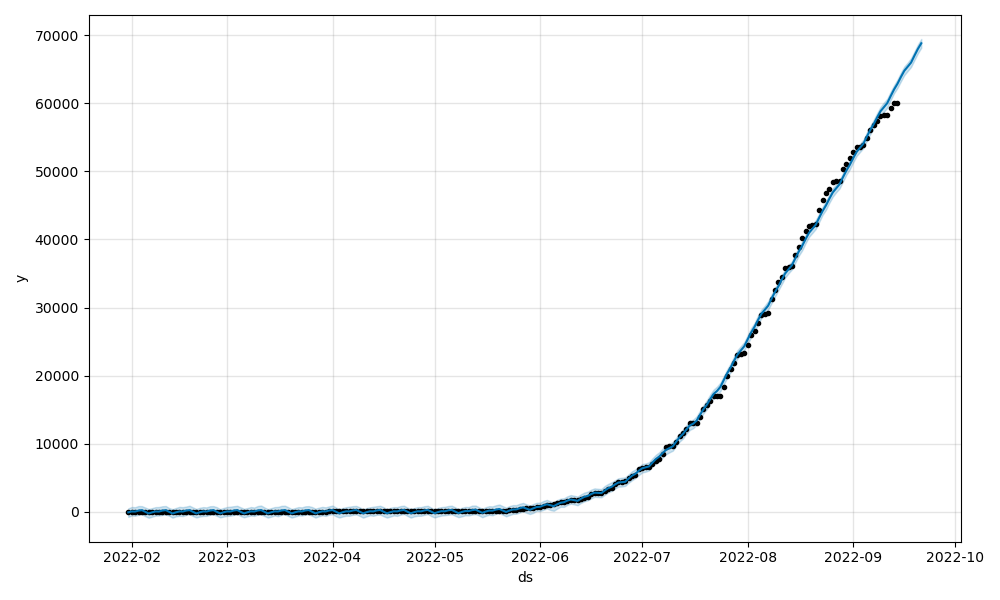
The graph below is a graph that processed the power demand data provided by Tokyo Electric Power Company(TEPCO) in Japan and predicted for 90 days.

The only package I’m using is “Profit”, but I’m getting very accurate data.

There are very useful packages, so they are also useful for power demand forecasting and power supply planning.

best regards
ktsh.tanaka.2020

dear anaconda_community_all

The graph below is based on monkeypox infected data from ourworldindata.org (URL: https://raw.githubusercontent.com/globaldothealth/monkeypox/main/timeseries-confirmed.csv), using the “Prophet” module. This is what I drew.
Notice how it accurately guesses the number of infected people with an eerie degree of accuracy.

Best Regards.
ktsh.tanaka.2020